
As we enter 2025, color trends in residential architecture continue to evolve, embracing a balance between nature-inspired hues and bold, expressive shades. Homeowners and designers alike are seeking colors that create warmth, enhance well-being, and add depth to both interiors and exteriors. This year’s trends emphasize sustainability, timeless elegance, and personalization, allowing for unique, curated spaces that reflect individual lifestyles and aesthetic preferences.
The first, and maybe our favorite trend this year are Earthy Neutrals and Warm Tones. The shift away from stark whites and cool grays continues as earthy neutrals dominate interior spaces. These shades provide warmth and a sense of grounded tranquility, making homes feel more inviting and harmonious. Think colors like Warm Beige and Sandstone, sun-kissed neutrals that add a cozy and sophisticated touch. Terracotta and Clay both are rich, organic tones that bring depth and warmth to living spaces using them as paint colors or in the actual materials themselves for flooring, wall tiles or backsplashes, or as smooth stucco within a kitchen or bathroom. And Earthy Greens that connect interiors to nature, promoting relaxation and balance, we’ve seen these in wallpaper, tiles ,and paint.


The second trend we’re in love with is serene blues and greens. Cool, calming shades of blue and green remain a popular choice, especially for bedrooms, bathrooms, and common areas where a sense of peace and retreat is desired. Think Dusty Blue or Slate, all elegant, muted blues that work beautifully as accent walls or cabinetry. Or Sage and Eucalyptus, soft green tones that offer a fresh, modern look without overpowering a space. These can be used for accent walls or accent materials like throw pillows or blankets.


Moving away from soft muted colors we are also seeing a Bold and Expressive trend in color this year. While neutral palettes provide the foundation, bold and playful accent colors add personality and depth to a home. Aubergine and Plum for example are deep purple hues that add sophistication and drama when pulled in as wallpaper or furniture color selections. Burnt Orange and Saffron are two vibrant warm hues that energize a space, think velvet accent chairs or living space armoires. Last but not least we’ve seen several homes in Architectural Digest already this year channeling colors like Charcol and Graphite, deep and dark shades that create moody safe spaces for your home. If you crave depth, we recommend pairing these vibrant colors with a texture to enhance their emotive capabilities.

Pulling back in the opposite direction we end with one more trend, soft pastels and muted shades. We’ve seen this is fashion already for Spring 2025, but are seeing it in interior design as well. For those who prefer a subtle approach to color, soft pastels continue to trend, bringing a modern yet timeless appeal. Blush and Dusty Rose used as solids or within a striped or repeating pattern soften a space, leaving it romantic and inviting without feeling overly feminine. We adopted this color pallet in our Katz and Hunter Residences. Colors like Powder Blue and Lavender add a soothing and ethereal quality to a home, think living and bedroom spaces, maybe paired with a rattan, blonde wood or other natural material. And then shades like Pale Peach and Buttercream have been popping up in kitchens and bathrooms this year, their ability to create a space that is fresh and bright never fail.


For the Exterior of your home this year we have seen several trends, some of them classics from the past, but a few are fun and unexpected in just the right ways. The connection between home and environment remains a key influence in exterior color choices, with homeowners opting for natural, organic tones that blend seamlessly into their surroundings. This is why colors like Warm Taupe, Greige, Stone Gray and Weathered Wood are at the top of our list this year. These soft neutrals complement various architectural styles and are hues that exude a timeless sophistication. Pair any of these tones with a Deep Sage or Forest Green for the perfect compliment and harmonious connection with your landscaping.
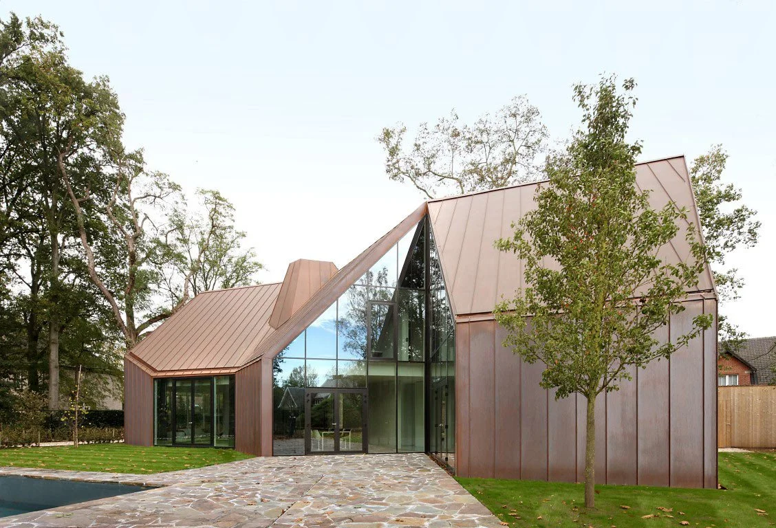
For clients looking for a little more excitement with their color choices, we recommend bold contrasting shades which are making a statement in modern exteriors, creating striking curb appeal through the interplay of light and dark shades. Think Black and White, Navy and Crisp White or Charcoal and Warm Wood, balancing industrial and organic elements of your exterior while playing with classic pairings that offer timeless and dramatic effects.


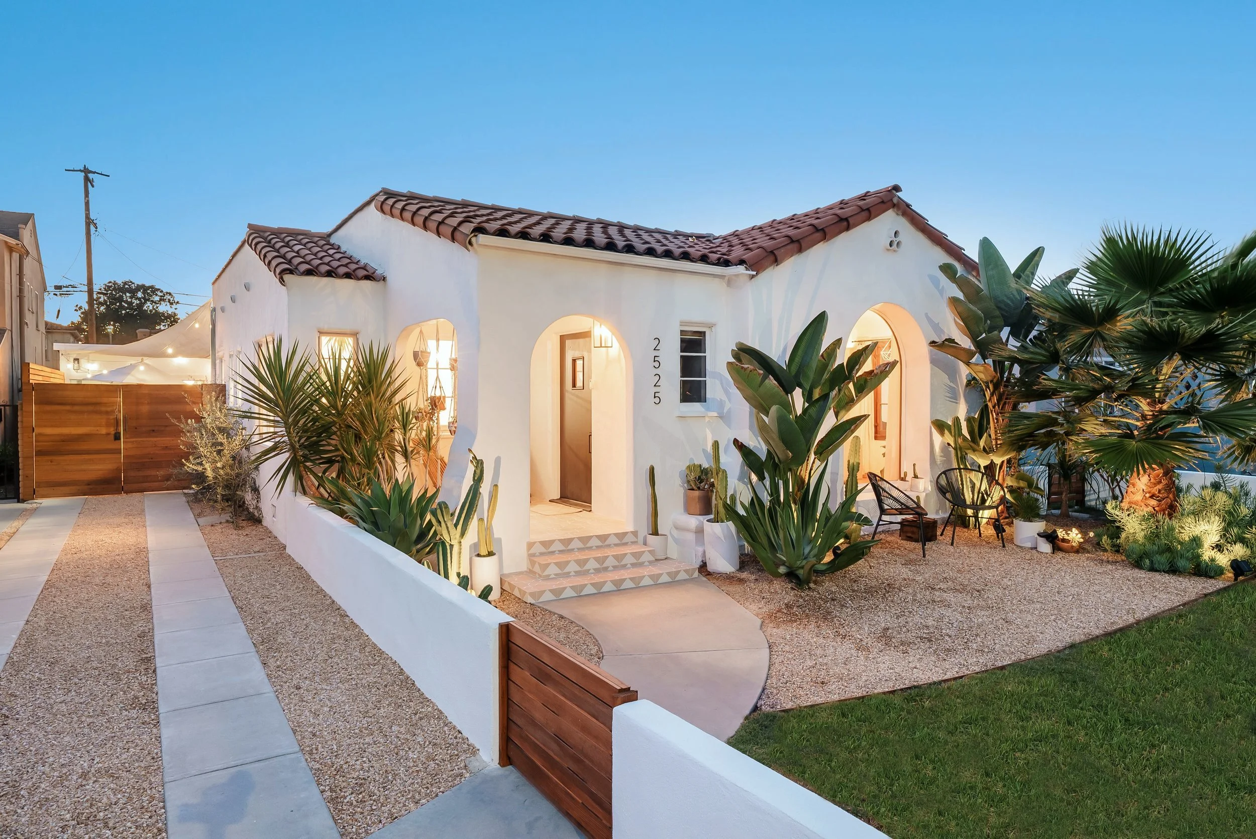
Inspired by the beauty of natural landscapes, earthy reds, and terracottas are gaining traction for exterior applications. While these colors lend themselves to more contemporary or spanish style architecture, there is always a way to play with them for any home. Rust and Copper are two rich, sun-baked tones that bring warmth and uniqueness to any home. Deep brick or Burgandy are classic yet bold colors that stand out without being overpowering in a neighborhood. And our favorite from this category of color trends are Terracotta and Clay, two versatile hues that can add color and material dimension to your exterior design, easily blending in with landscaping and other exterior features.
Lastly, for our clients who favor a timeless and elegant look, soft whites and warm creams remain a popular choice for exterior facades. Ivory, Warm White, Oatmeal, Pale Sand, all of these are understated hues that age gracefully with time while keeping a clean and fresh appearance to your homes exterior. You can also bring in trending colors like Buttercream or Almond, if shades of whites are just too neutral for you, these allow you to play with a little color without committing to something too bold or isolating. All of the colors in this family will give your home a soft and inviting feeling. See more of our Glen Oaks Residential project here.

Selecting the right colors for your home involves considering various factors such as lighting, architectural style, and personal preferences. Here are a few tips to help guide your decisions. You’re going to want to consider the natural light that hits your home, the amount of sunlight your home receives can impact how colors appear. Warmer hues can balance cool lighting, while cooler shades can refresh sun-drenched spaces. Then think about the architectural style of your home. Traditional homes often suit classic, muted colors, while contemporary designs can handle bolder contrasts. Think about how longevity of your color choices as well, do you plan to repaint every 3 years or 10 years, are you selling this home in 5 years and maybe need a color that appeals to a broader audience when that time comes? Trendy colors can be fun, but for long-lasting appeal, consider timeless neutrals with the option to add accent colors over time. And lastly, something that has been really important to homeowners this year is harmonizing with their surroundings. Whether this usually comes through in material and landscaping choices, we have noticed this with paint selection as well this year. Take inspiration from your landscape and neighborhood to ensure a cohesive and aesthetically pleasing exterior.

The color trends of 2025 reflect a shift towards warmth, nature, and expressive individuality in both interior and exterior design. Whether you prefer timeless neutrals, serene blues, or bold contrasts, this year’s palette offers endless possibilities to personalize and enhance your home. By embracing these trends thoughtfully, you can create a space that feels both contemporary and enduring.